Help Celyn, Harry, Jon & Serge Help The Birmingham Children's Hospital
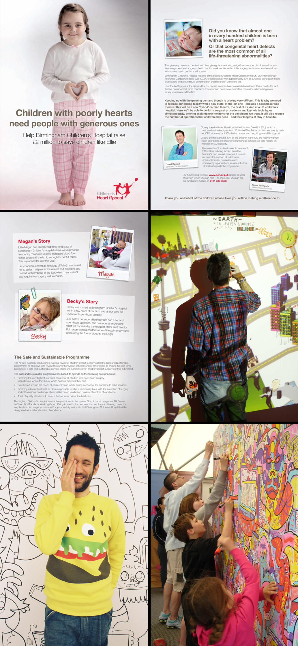
WE NEED YOU to help the Birmingham Children’s Hospital raise £2 million pounds to create the most advanced cardiac unit for children in the UK.
Début Art have teamed up with the hospital to put on a week-long Family Art Festival starting April 12 at the Bullring in Birmingham city centre, and finishing Sunday 18th April. With 4 Début Art illustrators doodling all week.
The new ‘hybrid’ theatre will allow different procedures to be carried out on the same patient, in the same room, at the same time. Meaning more patients/children can be treated.
In addition to increasing the number of patients that can be cared for, the new hybrid theatre will cut down the number of operations children often face. This means less stress on them and their families and less time in hospital, freeing up capacity for others.
With some of the money raised also being used to increase the number of intensive care unit beds available in the hospital from the current 20 to 31. Which in turn will reduce the need to send children to other hospitals. A good thing for sure right?
Celyn, Harry Malt, Jon Burgerman and Serge Seidlitz will be creating giant, heart-themed canvases live. Each artist will be drawing the outlines with visitors to the Festival getting involved colouring it in and maybe even getting to draw on a fireman or two.
The event starts on the 12th and Jon Burgerman will be there on the Monday, Harry Malt Tuesday and Wednesday, Celyn Thursday and Friday and Serge Seidlitz will be there for the weekend.
Our buddies at POSCA have very very kindly donated all the pens. The POSCA water-based marker range gives vibrant colours that are perfect for eye-catching designs that hog the limelight without fading in it. POSCA pens produce opaque, vibrant colour and can write on paper, plastic, glass and fabric. Used by artists all over the world they are perfect for creating unique attention-grabbing designs, illustrations and posters.
So... if you're up that way or know anyone that is please do get them to go along and support the Début Art guys and help them raise money for this worthy charity.
LINKS TO CHECK:
Donate NOW - Birmingham Children’s Hospital direct donations
Our Flickr for updates, we've created a set just for this project. Check here - Flickr.com/photos/debutart
Début Art's Twitter - twitter.com/debutart
POSCA's Twitter - twitter.com/uni_posca
See you there.
Recent articles

Justin Metz / Prisoner / SKY
Justin Metz worked with the team at Sky creative on the key visual for their new series 'Prisoner'. The artwork is up on 48 sheets around the UK right now. You can see more of Justin's work here

Max Loeffler / All Conditions Express / Nike
Max Loeffler created this excellent illustration for Nike's ACG All Conditions Express out of home campaign. The key visual was adapted too many different formats such as posters, postcards, stickers and various merchandise items. You can see more of Max's work here

Début Welcomes Marcial Rodrigo
Début Art is very excited to announce that we are now representing Marcial Rodrigo! Marcial is an illustrator and infographic designer from Seville, in the sunny south of Spain, who explores ways to fuse information with illustration. Detail-oriented and versatile, he combines simplicity and symbolism to communicate complex ideas clearly and effectively. With a style defined by precise, dynamic lines, his compositions balance visual and conceptual harmony, prioritizing both aesthetics and clarity—creating pieces that connect and invite visual reflection. His professional background, which spans from architecture to design, brings a unique perspective to his work. Now based in Málaga, he works with national and international clients, developing projects that deliver narrative depth and visual coherence. Clients include: El País-Retina, Santilla Editorial, Arup, Oliver Cabell, Fast Company, Modus Magazine, Golf Magazine, Drapers, Which? Magazine, Wunderman Thompson, Garaje de Ideas,...

A Rich Rice Brand Re-design
We are pleased to share packaging illustrations by artist Webb Creative for Oriente, a premium rice brand out of Portugal. Webb Creative was brought on by Firecactus Creative Director John-Paul Hunter who led the brand’s redesign. Inside the V-shaped illustration, which is actually two grains of rice coming together, are Webb’s illustrations. Each rice variant has a different scene, depicting the fifth-generation owners and moments from the business’s history. As Hunter shared with Design Week: “That illustration needed to work hard, we wanted people to see something different every time.” A further dive into the meaning of each illustration can be found on the back of the pack. You can check out details of the redesign and more of Webb Creative’s work here.