Matt Herring / Timeout: 50 Years, 50 Covers.
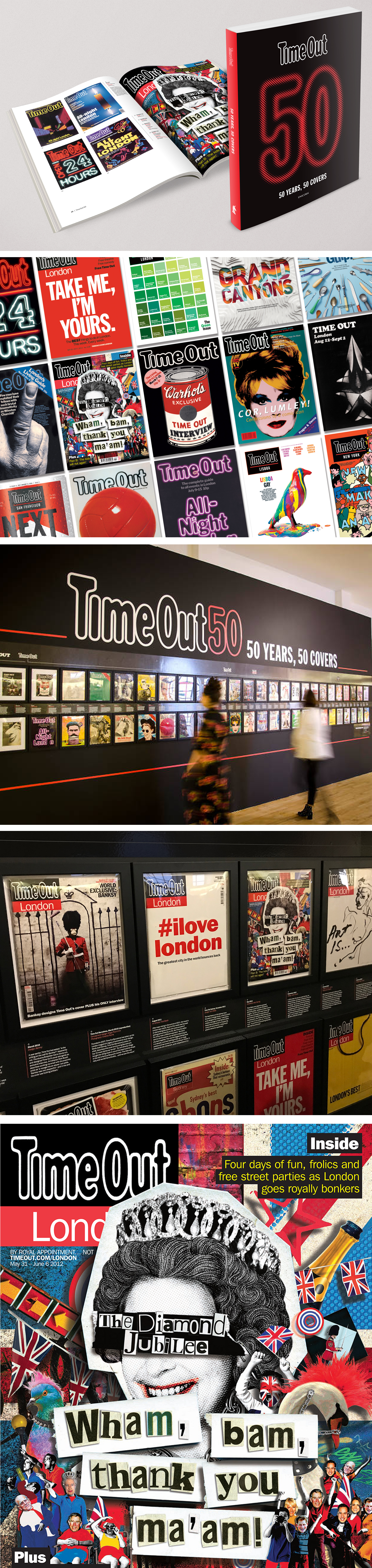
Of 2,500 Timeout covers published since 1968, Matt Herring’s Queen’s Diamond Jubilee cover makes the top 50 in this new exhibition at the London Museum of Brands, along side artists such as Banksy and Tracey Emin. A new book published by Unicorn accompanies the exhibition.
’Peter Blake was originally supposed to design a cover for Queen Elizabeth’s diamond Jubilee,’ explains art editor Anthony Huggins. ‘He did it, but it wasn’t quite right. So we sent his to design to our subscribers and commissioned illustrator Matt Herring to do this alternative, Sex Pistols-inspired version. It was a bit of a dry subject, so - in Time Out style - we wanted to do something that didn’t take itself too seriously!’
Did you know that Time Out is turning 50? It’s true: the first issue, put together by our founder Tony Elliott on his kitchen table, was published in August 1968. And we’re not the types to let a big birthday go uncelebrated. To mark half a century of bringing you the best of London, we’ve teamed up with the Museum of Brands https://www.timeout.com/london/museums/museum-of-brands-packaging-advertising in Ladbroke Grove to put together an exhibition of 50 amazing Time Out magazine covers.
‘Time Out 50: 50 Years, 50 Covers https://www.timeout.com/london/things-to-do/time-out-50-50-years-50-covers ’ charts five decades of London life through our front pages, from the very first issue to the explosion of Time Out around the world. It features 50 original magazines with cover stars including David Bowie, Elton John and Joanna Lumley, and designs by artists including Tracey Emin, Banksy and Jamie Hewlett.
A ‘Time Out 50’ book will also drop, published by Unicorn. It’s not every day you turn 50, so we’re doing this properly. Come party with us from September 12.
To see more of Matt's work click here.
Related artist
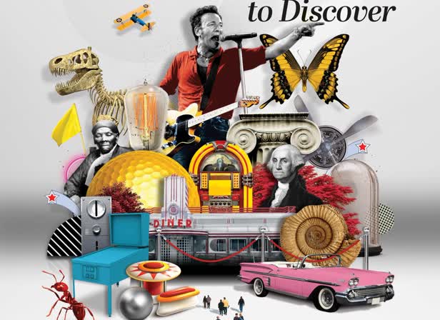
zMatt zHerring
Recent articles
Justin Metz / Prisoner / SKY
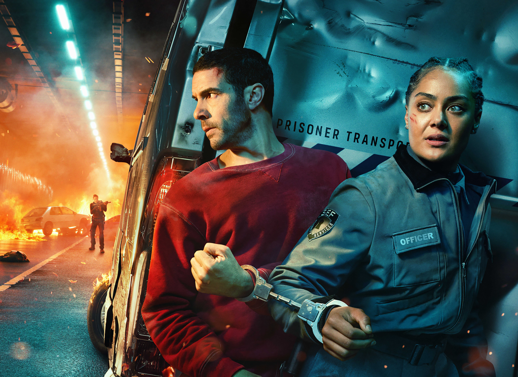
Justin Metz worked with the team at Sky creative on the key visual for their new series 'Prisoner'. The artwork is up on 48 sheets around the UK right now. You can see more of Justin's work here

Max Loeffler / All Conditions Express / Nike
Max Loeffler created this excellent illustration for Nike's ACG All Conditions Express out of home campaign. The key visual was adapted too many different formats such as posters, postcards, stickers and various merchandise items. You can see more of Max's work here

Début Welcomes Marcial Rodrigo
Début Art is very excited to announce that we are now representing Marcial Rodrigo! Marcial is an illustrator and infographic designer from Seville, in the sunny south of Spain, who explores ways to fuse information with illustration. Detail-oriented and versatile, he combines simplicity and symbolism to communicate complex ideas clearly and effectively. With a style defined by precise, dynamic lines, his compositions balance visual and conceptual harmony, prioritizing both aesthetics and clarity—creating pieces that connect and invite visual reflection. His professional background, which spans from architecture to design, brings a unique perspective to his work. Now based in Málaga, he works with national and international clients, developing projects that deliver narrative depth and visual coherence. Clients include: El País-Retina, Santilla Editorial, Arup, Oliver Cabell, Fast Company, Modus Magazine, Golf Magazine, Drapers, Which? Magazine, Wunderman Thompson, Garaje de Ideas,...
A Rich Rice Brand Re-design
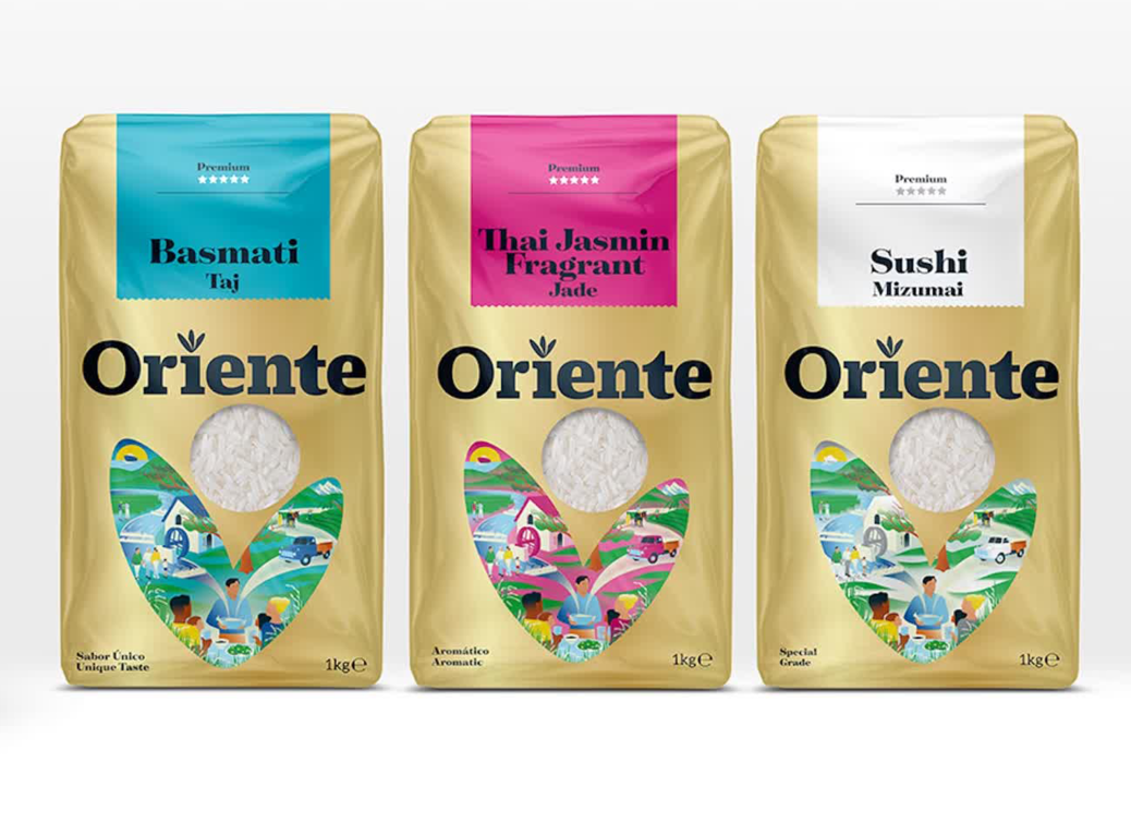
We are pleased to share packaging illustrations by artist Webb Creative for Oriente, a premium rice brand out of Portugal. Webb Creative was brought on by Firecactus Creative Director John-Paul Hunter who led the brand’s redesign. Inside the V-shaped illustration, which is actually two grains of rice coming together, are Webb’s illustrations. Each rice variant has a different scene, depicting the fifth-generation owners and moments from the business’s history. As Hunter shared with Design Week: “That illustration needed to work hard, we wanted people to see something different every time.” A further dive into the meaning of each illustration can be found on the back of the pack. You can check out details of the redesign and more of Webb Creative’s work here.